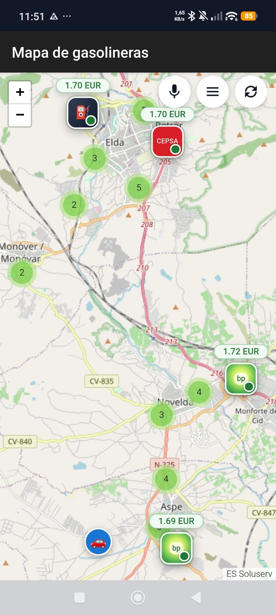
Mobile map view
Check nearby stations, prices directly on the map, and quick actions from a layout designed for immediate readability.

The new landing page presents Gasolineras Auto as a product ready for Google Play: clearer, brighter, and supported by real app screenshots so visitors understand in seconds what it does and how it is used.
A broader visual gallery has been added so the site explains the product better and does not depend only on text. The screens now cover mobile mode, search flows, and the Android Auto experience.
Check nearby stations, prices directly on the map, and quick actions from a layout designed for immediate readability.
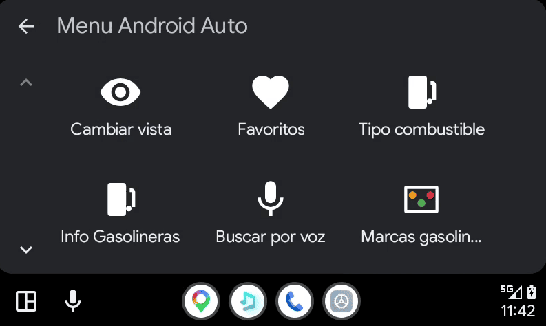
Large direct actions to change view, open favorites, or launch voice search without losing focus.
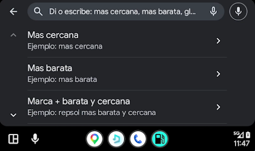
The app suggests voice command examples to ask for the nearest, the cheapest, or a combined brand and distance search in seconds.
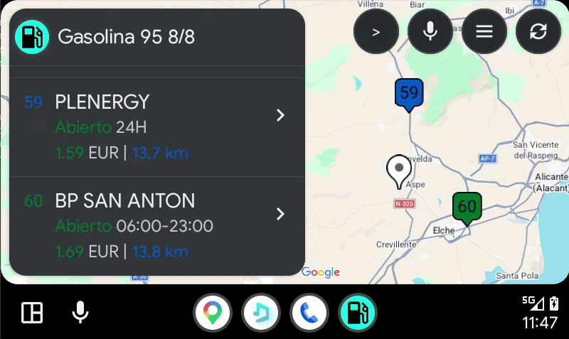
The app keeps visual context with a clear station list and a compact map for lower-friction navigation.
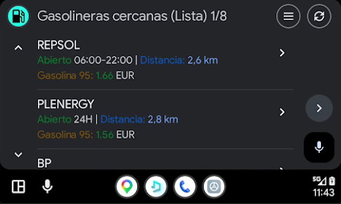
The list view prioritizes price, distance, and opening hours for quick comparison even with the simplified in-car interface.
The dynamic data has been clarified so users understand it refers to the station feed, not the app version or deployment status.
Date of the latest refresh of the server station feed.
Total stations currently indexed in the service database.
Stations with liquefied petroleum gas availability in the current dataset.
The goal is for any visitor to understand the product value, see real usage screens, and perceive a more polished, current finish.
The experience puts the important information first: price, distance, availability, and station brand.
The gallery shows that Android Auto is not a hidden extra, but a core part of the product.
The landing page blends product presentation with useful backend information without sounding overly technical or confusing.